I build brands.
Then I build what builds them.
Brand transformation. Creative leadership at scale. The future of creative.


Press
April 2026
CNBC
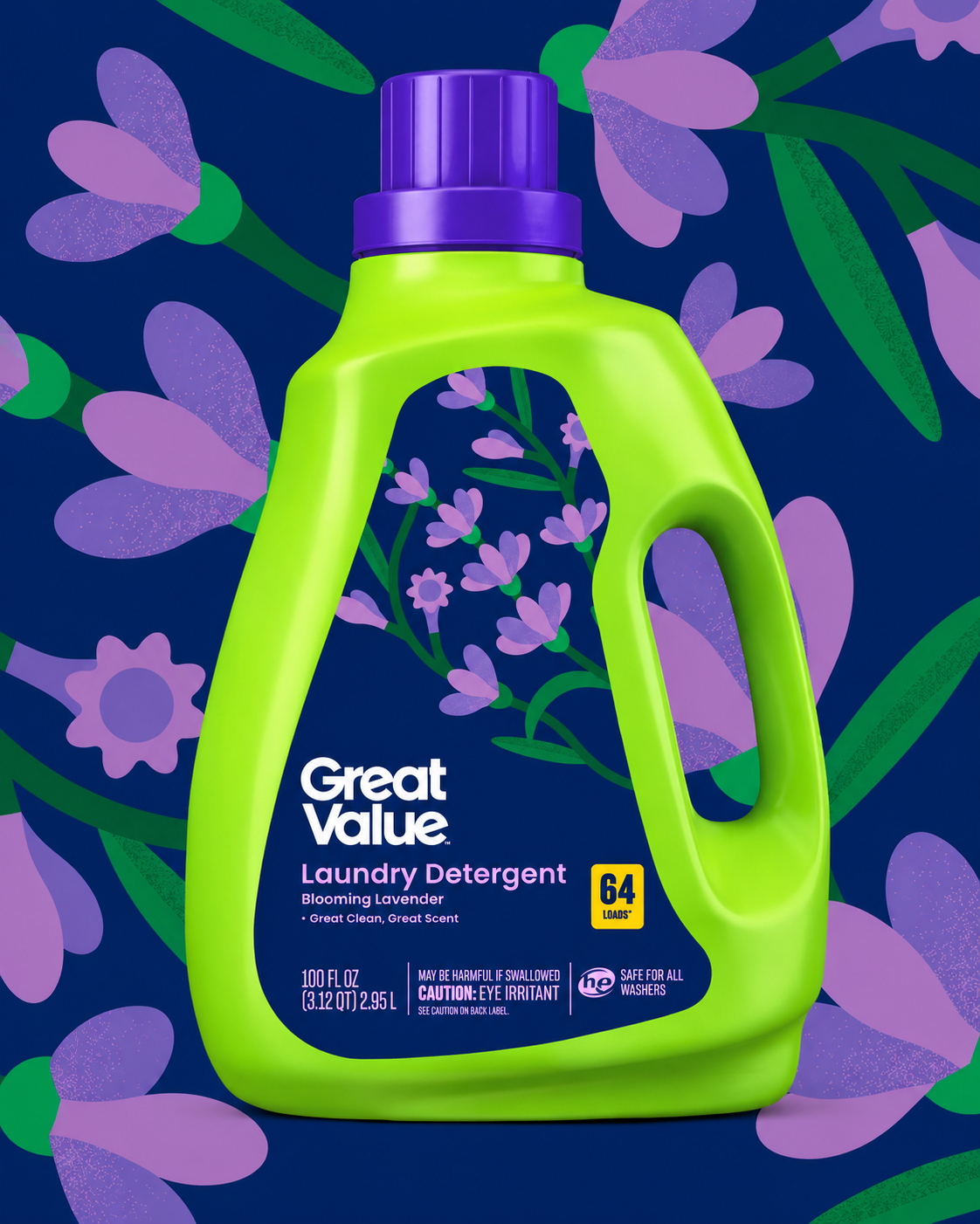
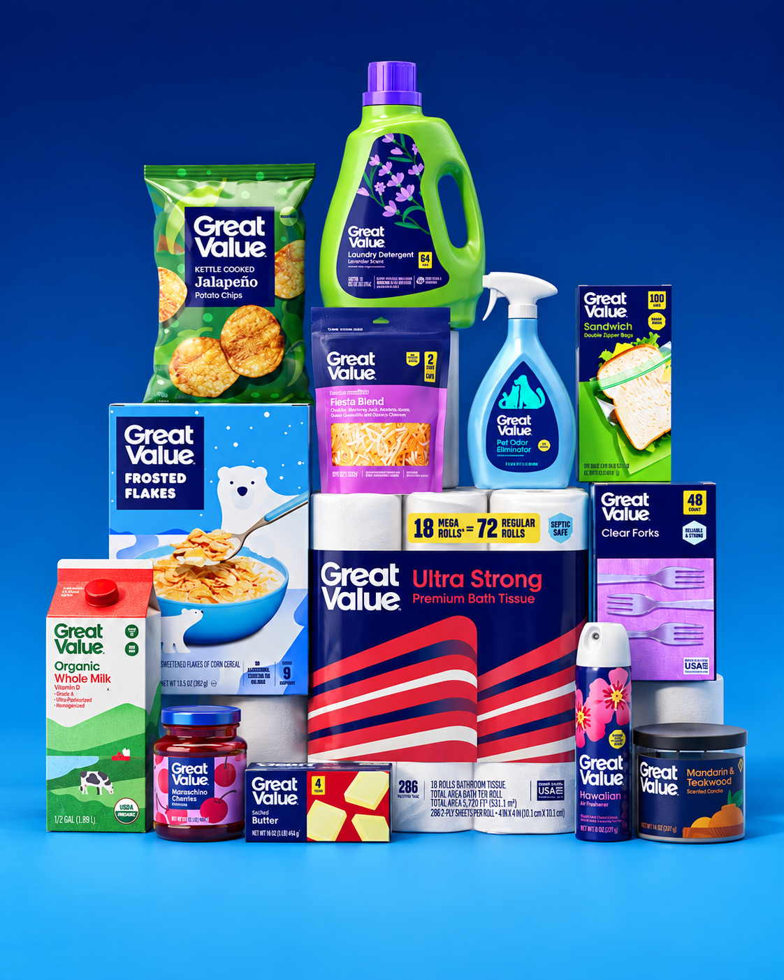
Starting in May, the brand’s approximately 10,000 items that span from LED lightbulbs to gallons of milk and frozen chicken nuggets will hit the shelves in new packaging, the company announced Wednesday. Walmart first launched the brand in 1993 and hasn’t changed its look in more than a decade.
“In an interview with CNBC, David Hartman, Vice President of Creative at Walmart, said customer research indicated that shoppers liked the quality and price of the products, but didn’t feel proud to display it in their home or with their families.

January 2025
Brand New UnderConsideration
Let the Sparks Fly
“In this new rendition, the Spark feels softer, warmer, and more friendly while being so much better executed with smoother curves and more pleasant individual segments than before, where it looked overly mechanical. The bolder weight of the segments gives the icon more presence and strength to stand on its own as it moves forward as the company’s primary logo.”
“Overall, this is an amazing improvement for Walmart, takes some of the best traits from its design history that, thanks to Father Time and Design Trends, have aged well and mixes it with the recent success of the Spark icon to establish a bold, confident, and engaging identity for the next 25 years.”
June 2025
Marketing Dive
Walmart challenges consumer perceptions with ‘Who Knew?’ campaign
Walmart is reintroducing itself to consumers who may not be aware of its full range of capabilities with its latest campaign. The effort follows the big-box store’s recent brand refresh, which included a new typeface, more vibrant colors and a larger emphasis on its spark logo. The refresh also included a focus on delivering greater consistency across channels like its app and website, moves meant to support its goals as an omnichannel retailer.

January 2025
CreativeBloq
Walmart's bold new branding is the definition of a glow up
“When a brand like Walmart refreshes its logo, the design world sits up and notices. It's one of the most recognisable logos on the planet thanks to the chain's dominance in retail – and the logo itself is an example of simplicity done exquisitely (as with many of the best logos). The brand has refreshed its identity for the first time in almost 20 years, and the result is the truest definition of a glow up.”
May 2026
Forbes
Walmart recently announced a “modern redesign” of its Great Value private brand. According to the press release, this is the first major change in more than a decade.
David Hartman, Vice President, Creative, at Walmart says, “Great Value has earned customers’ trust over decades, and while the brand is getting updated, what’s inside isn’t changing. Customers will continue to find the same trusted products at the same every day low prices they rely on.”

January 2025
Fast Company
Walmart's bluer new brand is its biggest update in nearly two decades
“The 255 million customers who visit Walmart each week are about to see something new—and even more blue—because Walmart is introducing its first brand update in nearly two decades.”

January 2025
AdAge
New branding draws on founder Sam Walton’s trucker hat but also aims to modernize its image
“Walmart is doing a brand refresh, tweaking its wordmark, trade dress and other specifications, for the first time in nearly 17 years. While the changes are subtle enough that a lot of people may not notice, they collectively amount to a big change for a giant retailer with more than 4,600 stores in the U.S. alone.”

January 2025
AdWeek
Is Walmart's Spark Logo Strong Enough to Stand on Its Own? Headquarters Thinks So.
“On Monday, the retailing colossus unveiled the first major refresh to its brand assets since 2008. The tweaks are subtle—mostly a bulking up of its typeface along with some color adjustments—but the simplicity belies more ambitious aims.”
“We’re building on assets that the customer recognizes from Walmart and we’ve strengthening those assets. We want to be able to build and strengthen the equity we have in the spark, so that it can be, over time, a standalone symbol for our brand.”
April 2026
Fast Company
Until now, Great Value’s packaging has been designed to telegraph low prices: Walmart estimates that these products save the average family more than 35% annually compared to national brand equivalents. Its white background, blocky letters, and straightforward blue logo were meant to signal a no-frills brand with products that are good for your wallet.
The redesign is a deliberate move to close the consumer sentiment gap between Great Value products and their look by making the packaging cleaner and more elevated, according to David Hartman, Vice President of Creative at Walmart.
April 2024
The Drum
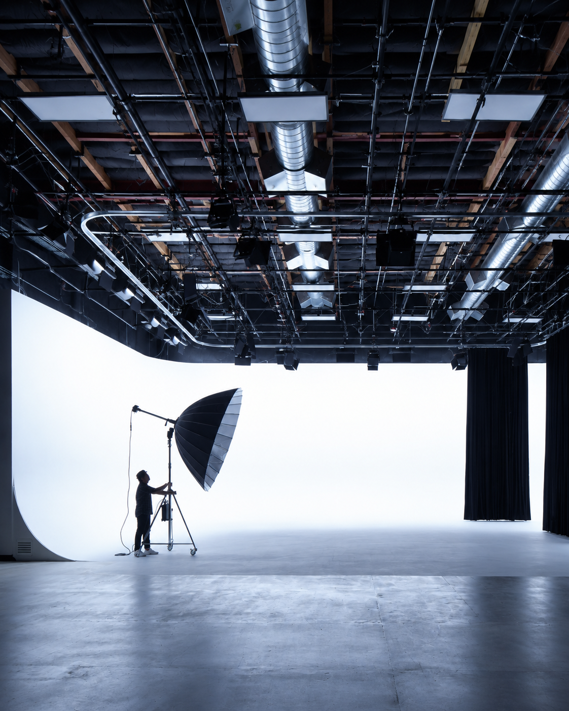
See inside Walmart’s colossal, new Los Angeles based creative studio with Vice-President of Creative, David Hartman
“Lights, camera, action: on an exclusive tour and interview, Hartman guides The Drum’s LA reporter through the 80,000-square foot studio in Playa Vista, revealing its prolific production capabilities and proximity to LA’s brightest creative minds.”
November 2025
Marketing Dive
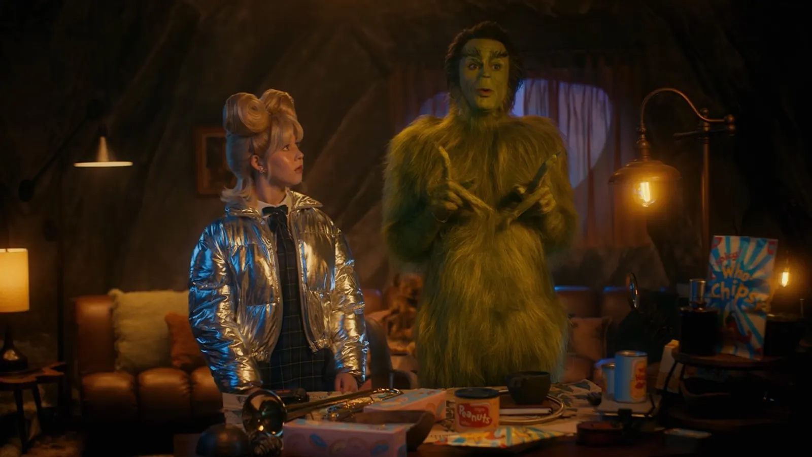
How Walmart is deploying the Grinch to boost Holiday marketing
“The notion of reinterpreting a Holiday classic helps us appeal to our customers in a more emotional way, but it also allows us to deliver the strategy and business-driving components of the campaign that we need it to do,” said David Hartman, Vice-President of Creative at Walmart. “Recognizable figures like the Grinch help Walmart open the door of attention for our customers during a crowded period for retail marketing.”
November 2025
AdAge
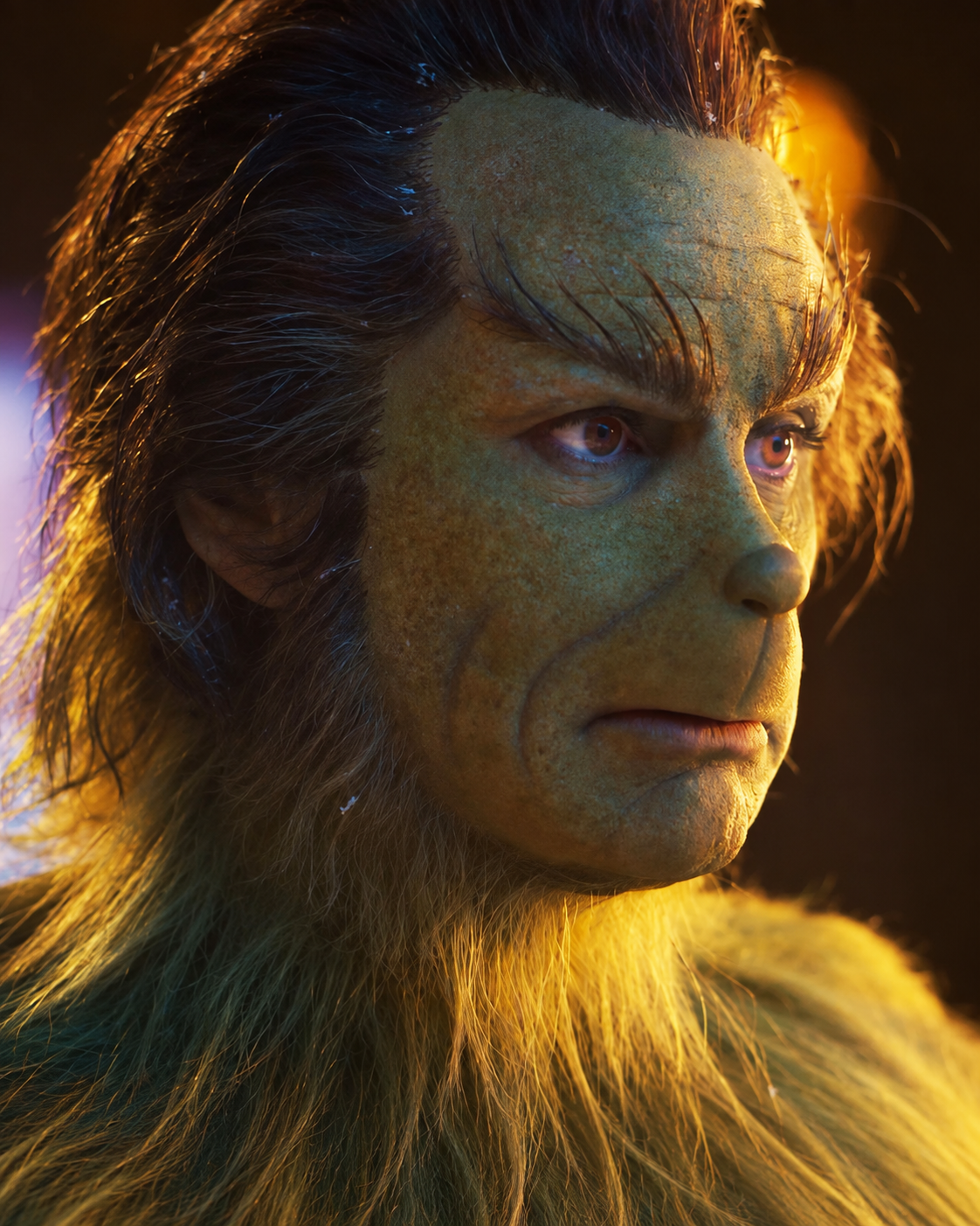
Walton Goggins is Walmart’s Grinch: inside the retailer’s holiday campaign
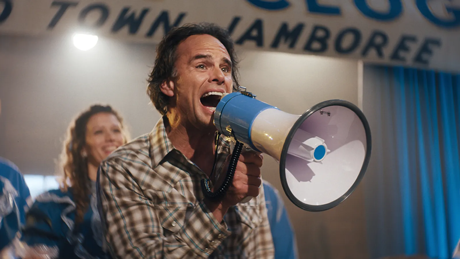
Walmart is bringing its “Who Knew” campaign into the holidays with “WhoKnewVille,” its take on the colorful town of Whoville from Dr. Seuss’s 1957 classic “How the Grinch Stole Christmas.” The campaign stars Walton Goggins as the Grinch in a two-and-a-half-minute spot debuting Monday.